English colours or light shades of pastel colours are seen everywhere. They are soft and muted shades guaranteed to give a delicate feel. Artists and crafters use pastel colours a lot. So what is so special about these colours.
What is a pastel colour
By adding white to primary or secondary colours we get pastels. These colours are also called paler, washed out, light or muted. The addition of white colour sends a powerful psychological message to the brain. Most important of all, the darker and more intense shades are replaced by their cooler or softer versions.
Effect of pastels on people
Romance. Falling in love and that feeling of floating with the clouds. Lighter pastel colours invoke that feeling in people. So using these colours in your craftwork automatically inspire romantic feelings when people see it.
Made for occasions. Birthdays, anniversaries, baby showers, bachelorette parties, pastels work with such occasions. Any gifting ideas, their colours never go wrong.
Custom made for children and babies. Pastel colours work wonderfully with children and make them happy. Wall paint, furniture design, wall decor, etc mostly comes in pastel colours. Any custom made gift made with pastels is a hit with children.
Spring season colours. Pastel colours remind us of the spring season when everything comes to life. In India spring is called Vasant Ritu. This season is considered one of the most beautiful seasons all over the world. The word spring originates from the idea of plants springing from the ground. It is associated with revival, rejuvenation and rebirth. Art work or gift ideas using pastel colours straight away bring memories of spring to anyone who sees it. This is the time of year in India where we come out of our lazy winter routine with excitement and euphoria. Days become longer and there is brighter sunshine. Birds and butterflies abound and there is happiness all around.
Examples of pastels
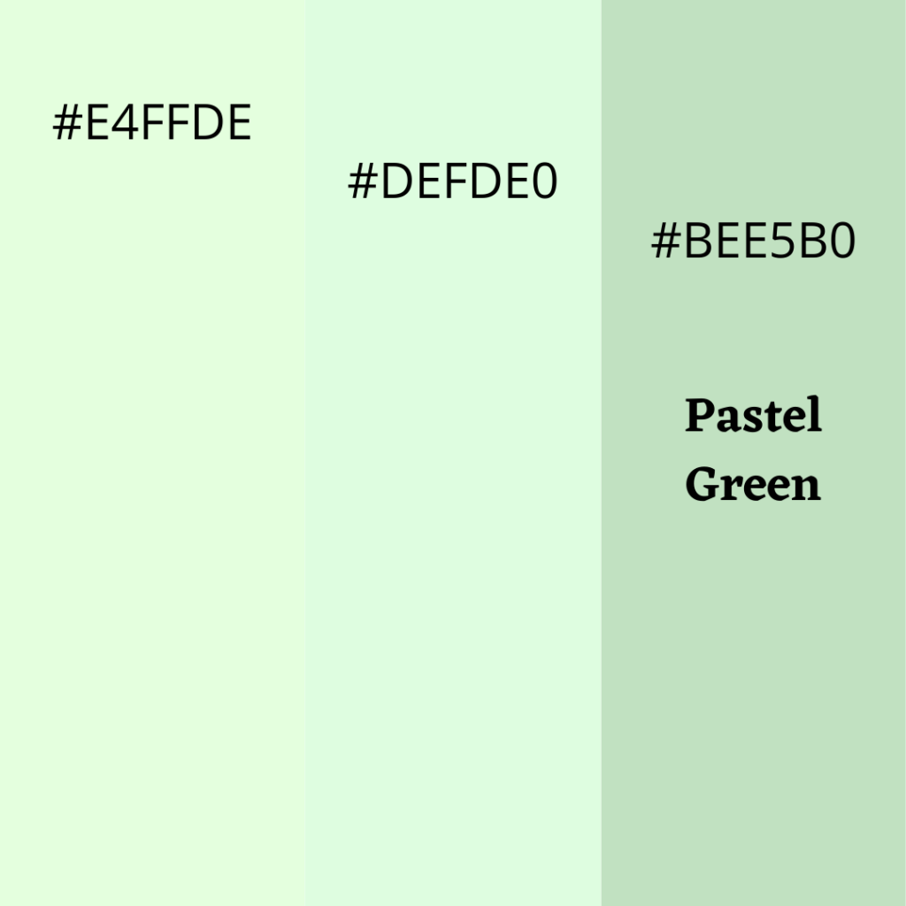
Lighter shades of pastel green
Pastel green is hex code #BEEB0. Examples of lighter shade are #E4FFDE & #DEFDE0.
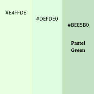
This is the strongest of the pastel colour, yet gives a sense of lightness and airy. Artists and crafters use this colour as the base. If you are going to use only light pastel colours in your work, this is the only colour you can use as a base.
Lighter shades of pastel blue
Pastel blue is #C9D6E8. Examples of lighter shade are #DEF3FD & #D0FFFE.
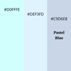
This is the second lighter pastel colour which can be used in wide swatches for your art and craft. Mostly used with baby gifts and decoration especially for the boys room.
Lighter shades of pastel pink
Pastel pink is #F0B6D5. Examples of lighter shade are #FFD3FD & #FDDFDF.
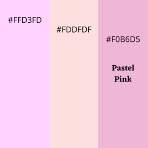
Pink and pastel pink can be used as good contrasting colours. Towards edges and curves, pink can give good accents. You can even use lighter shades of pink as base colours but it will be very bold.
Lighter shades of pastel orange
Pastel orange is #FBBB62. Examples of lighter shade are #FCF7DE & #FFE7D3.
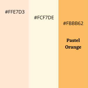
Lighter shades of pastel orange can be used as base colour to give an earthly look. It is a neutral colour and the addition of white helps bring out the stark yet exciting look.
Lighter shades of pastel yellow
Pastel yellow is #F8F1AA. Examples of lighter shade are #FFFDDB & #FDFBE7.
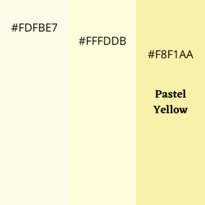
Similar to orange, lighter shades of yellow are also easily used as base colour. It can also be used as a contrast to green.
Lighter shades of pastel lavender
Pastel lavender is #D7B4F3. Examples of lighter shade are #DDD3EE & #F0DEFD.
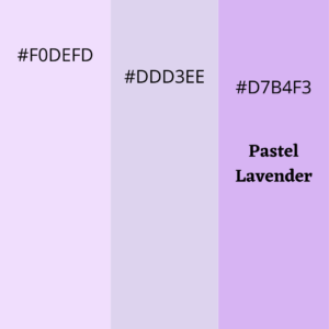
Lavender looks similar to purple. It gives a rich look to all your designs and it is the colour of royalty. Flowers come out good in this colour.
Summary
Pastels are gorgeous colours and universally liked. This hex code guide should give you the basic idea to move ahead. For any more queries, we are there to help.